The housing market isn’t broken—it’s just misunderstood.
Mortgage rates are still elevated, not because the Fed hasn’t acted—but because inflation remains sticky and the economy is sending mixed signals. Add in uncertainty around tariffs, global unrest, and shifting policies, and it’s no wonder buyers feel uneasy.
Affordability has become a real challenge. Prices remain high, and even with some downward pressure on rates, many are finding monthly payments tough to manage.
If you’ve been watching the headlines and thinking, “Why isn’t anything adding up?”—you’re not wrong. But the confusion usually comes from missing context, not missing logic.
Here are 3 charts that explain what’s really going on—and how to move forward with more clarity and confidence.
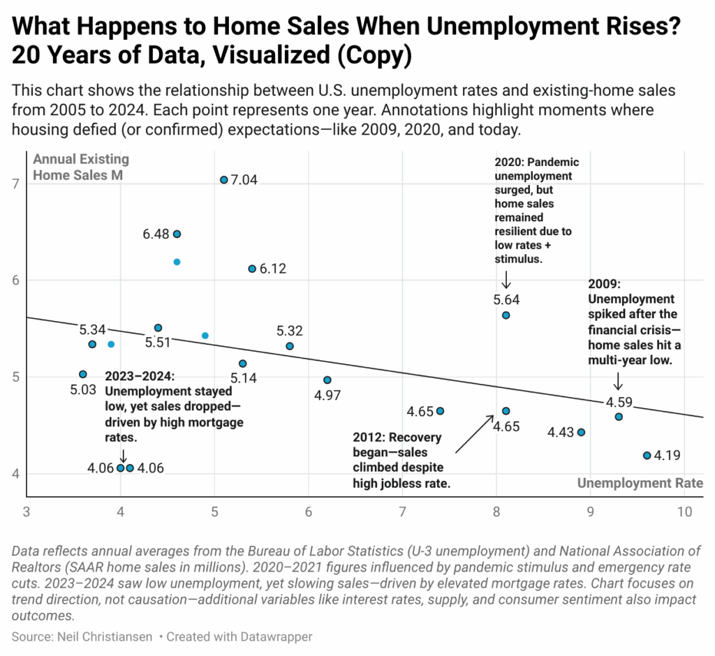
1. Job Losses Don’t Automatically Crash the Market
The housing market is more resilient than people think.
In the last 20 years, we’ve seen multiple economic disruptions—each one raising fears of a housing crash. But the data tells a more stable story. Our first chart compares unemployment rates and home sales since 2005.
Interactive Chart – https://www.datawrapper.de/_/yRSJO/?v=3
Even in times of rising job loss, home sales held surprisingly steady—especially when the downturns were short or unevenly distributed. Buyers with job stability still moved forward. What matters most isn’t the national unemployment rate—it’s your income, confidence, and timeline.
Don’t let big-picture headlines scare you out of personal opportunities.
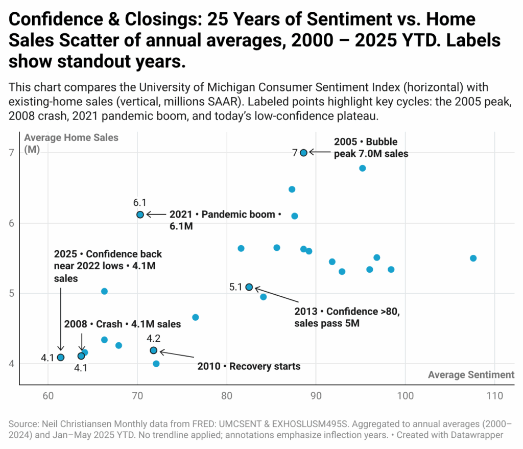
2. Consumer Confidence Drives Market Activity
It’s not just about the rate—it’s about how people feel.
Our second chart shows how consumer confidence closely aligns with existing home sales. When people feel uncertain—about the economy, their job, or the future—they pause big decisions. Even if mortgage rates drop.
That’s why lower rates don’t always “fix” the market. Real estate moves when people feel stable and secure.
Interactive Chart – https://www.datawrapper.de/_/yRSJO/?v=3
Confidence is the quiet engine of the housing market.
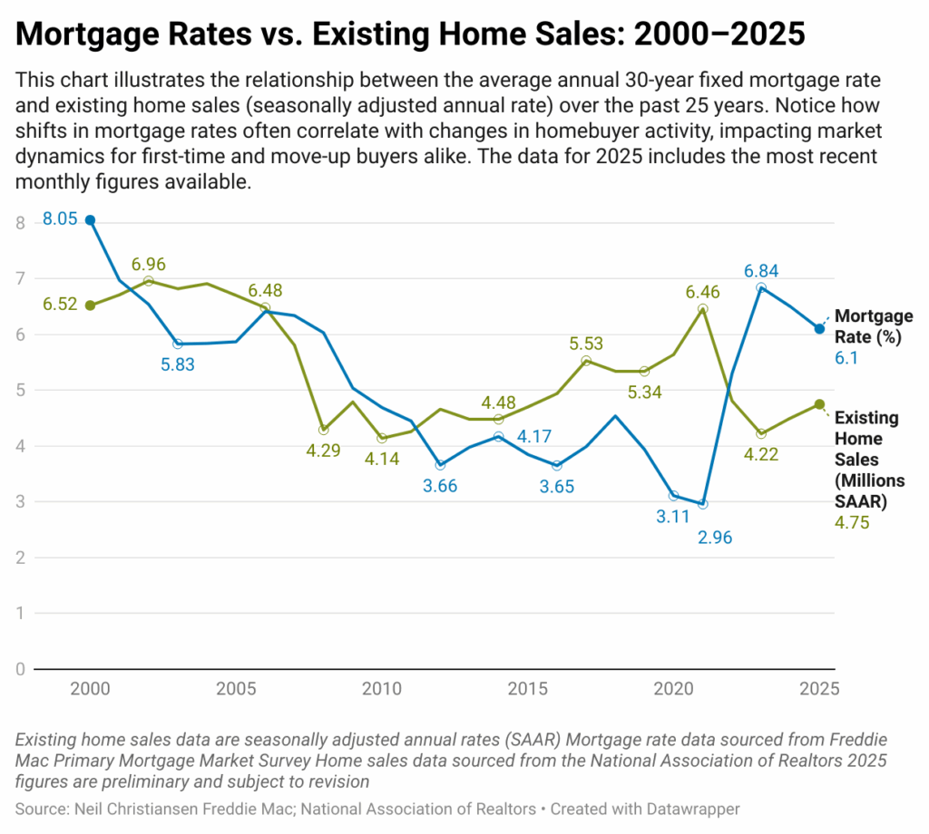
3. Mortgage Rates vs. Existing Home Sales
The connection between rates and sales is real—but not absolute.
In the third chart, we compare 30-year mortgage rates and home sales from 2000 through today. The correlation is clear in some years, and absent in others. The takeaway? Rate movement alone doesn’t drive activity—it’s timing, inventory, and confidence combined.
For buyers waiting on rates to hit a magic number, this chart offers a more grounded strategy: watch the full context, not just the interest line.
Interactive Chart – https://www.datawrapper.de/_/K96o5/
The most informed buyers don’t just chase low rates—they plan around real trends.
If you’re feeling stuck or unsure, that’s okay. These charts weren’t made to push you—they’re here to guide you.
Want to see what this means in your area?
I’ll send you a personalized Real Estate Report Card—showing local appreciation, affordability, renter trends, and more.
Just send me the city, county, or zip code you’re interested in. I’ll prep the report and send it over. No pitch. No pressure. Just useful info to help you make a smart move.